Mobile Matters: Why Parents Browse on Phones
How to ensure your website works perfectly for mobile-first parents who search for daycare on their phones.

Mobile Matters: Why Parents Browse on Phones
Here's a statistic that should stop you in your tracks: over 70% of parents now search for childcare primarily on mobile devices.
Not desktop. Not laptop. Phone.
If your daycare website doesn't work flawlessly on mobile, you're invisible to most of your potential customers.
This guide explains why mobile matters so much, what mobile-friendly really means, and how to make sure your site captures those phone-browsing parents.
The Mobile Revolution in Parent Behavior
The shift to mobile didn't happen overnight, but it's now complete. Parents in 2026 search for daycare the same way they search for restaurants, products, and services: on their phones.
When Parents Search on Mobile
Mobile searches happen throughout the day:
- Morning commute (if they take public transit)
- Lunch breaks (quick research between bites)
- Waiting rooms (doctor's office, oil change, etc.)
- While kids nap (quiet browsing at home)
- Late evening (after kids are in bed—prime research time)
- Weekends (soccer practice waiting, grocery store lines)
These are micro-moments—brief windows when parents have a few minutes to research. Your website needs to load fast and provide value in those 2-3 minute windows.
The Multi-Device Journey
Parents rarely research entirely on one device. A typical journey looks like:
- Phone search during lunch break (find 5-6 options)
- Phone browsing to quickly eliminate obviously bad choices (down to 2-3)
- Desktop/laptop in evening to dig deeper (compare final candidates)
- Phone to schedule tour or call
If you fail at step 1 or 2, you never make it to step 3. Your website is eliminated before parents ever see it on a big screen.
What This Means for Daycares
- First impressions are mobile impressions. Your phone site IS your website for most parents.
- Speed is everything. Parents will abandon slow mobile sites in seconds.
- Friction kills. Any difficulty (tiny text, broken forms, hidden contact info) = lost parent.
- You're competing with Amazon-level expectations. Parents expect your site to work as well as their favorite shopping apps.
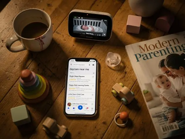
How Parents Search for Daycares
Understanding the search process helps you optimize for it.
The Search Pattern
- Google search (often "daycare near me" or "[city] daycare")
- Quick scan of results (looking at ratings, proximity, hours)
- Tap top 3-4 results (opening websites in tabs)
- Rapid elimination (any site that's slow, ugly, or confusing gets closed)
- Deeper research on remaining 1-2 options
- Call or schedule tour (often directly from mobile)
What Parents Look for on First Mobile Visit
In those first 10-20 seconds on a mobile site, parents are checking:
- Is this place near me? (Address visible without scrolling)
- Are they open when I need them? (Hours easy to find)
- Do they take my child's age? (Infant? Toddler? Preschool?)
- Is this place legitimate? (Professional design = professional center)
- Can I contact them easily? (Click-to-call phone number)
If any of these are hard to find, the parent moves on. They have 20 other options a tap away.
The Elimination Game
Parents are looking for reasons to exclude you, not include you. It's faster to eliminate options than evaluate them thoroughly.
Your job is to not give them reasons to exclude you.
Common mobile deal-breakers:
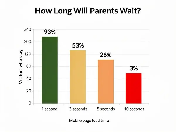
- Site doesn't load (takes more than 3 seconds)
- Text is too small to read
- Phone number isn't clickable
- Hours aren't visible
- Site looks outdated or sketchy
- Contact form is broken or impossible to fill out
- Pop-ups block the screen
What Mobile-Friendly Really Means
"Mobile-friendly" gets thrown around a lot, but what does it actually require?
The Technical Requirements
| Requirement | What It Means | Why It Matters | |-------------|---------------|----------------| | Responsive design | Site adapts to screen size | Works on all devices | | Large text | 16px minimum | Readable without zooming | | Large touch targets | 44x44px minimum | Buttons easy to tap | | Fast loading | Under 3 seconds | Parents won't wait | | No horizontal scroll | Everything fits width-wise | No frustration | | Simplified navigation | Hamburger menu OK | Easy to find things |
What Parents Experience
On a truly mobile-friendly site, a parent can:
- Load your homepage in 2-3 seconds on cellular data
- Read your center's name and main message without zooming
- Find your phone number without scrolling much
- Tap your phone number to call (one action)
- Find your address and tap to get directions
- View photos without pinching or rotating
- Submit a contact form without frustration
- Navigate to other pages without hunting
The "Thumb Zone" Test
Hold your phone with one hand. Your thumb can easily reach the bottom two-thirds of the screen, but struggles with the top and far corners.
Mobile-friendly design puts important elements in the "thumb zone":
- Call button (bottom of screen)
- Navigation (bottom or hamburger menu)
- Contact form (scrollable, not tiny)
- Key information (center of screen, not edges)
Common Mobile Mistakes
Even centers with good intentions make these errors:
Mistake #1: Tiny Text
The problem: Text that looks fine on desktop is unreadable on mobile without zooming.
The fix: Use a minimum of 16px font size for body text. Test on actual phones.
Mistake #2: Unclickable Phone Numbers
The problem: Phone number is text, not a link. Parent has to memorize or copy-paste.
The fix: Format phone numbers as links: (555) 555-1234
Mistake #3: Forms That Don't Work
The problem: Contact forms with tiny fields, hard-to-tap dropdowns, or submit buttons that don't work on mobile.
The fix: Test every form on a phone. Use large input fields, simple dropdowns, and big submit buttons.
Mistake #4: Pop-Ups and Modals
The problem: Pop-up windows that are hard to close on mobile, or that cover the entire screen.
The fix: Avoid pop-ups entirely on mobile, or ensure they're easy to dismiss with a large X button.
Mistake #5: Horizontal Scrolling
The problem: Site is wider than the phone screen, forcing parents to scroll sideways.
The fix: Use responsive design that automatically adjusts width to the screen.
Mistake #6: Slow Loading Images
The problem: Giant hero images that take 10+ seconds to load on cellular data.
The fix: Compress images, use WebP format, implement lazy loading.
Mistake #7: Buried Contact Info
The problem: Phone number and address are only on the "Contact" page, which requires multiple taps to find.
The fix: Phone number in header (clickable). Address in footer (on every page).
Speed on Mobile Networks
Speed matters everywhere, but it's especially critical on mobile.
Why Mobile is Slower
- Cellular connections vary wildly (5G to 3G depending on location)
- Data caps mean some users have slow connections
- Interference from buildings, tunnels, elevators
- Shared bandwidth in crowded areas
Your site needs to work well even on slower connections.
Speed Targets
| Element | Target | Consequence if Slow | |---------|--------|---------------------| | First contentful paint | Under 1 second | User perceives delay | | Largest contentful paint | Under 2.5 seconds | User may abandon | | Time to interactive | Under 3.5 seconds | User can't tap/click | | Total page weight | Under 1 MB | Slow data connections suffer |
How to Speed Up Mobile
- Compress images (biggest impact)
- Minimize scripts (each script adds load time)
- Use a CDN (content delivery network serves from nearby servers)
- Enable caching (returning visitors load faster)
- Reduce redirects (each redirect adds time)
- Use AMP selectively (Accelerated Mobile Pages for critical content)
Test Your Speed
Use these free tools:
- Google PageSpeed Insights (desktop and mobile scores)
- GTmetrix (detailed breakdown)
- WebPageTest (test from different locations/devices)
Aim for mobile scores above 80 on PageSpeed Insights.
Touch-Friendly Design
Mobile users interact with fingers, not mice. Design accordingly.
Button and Link Sizes
- Minimum touch target: 44x44 pixels (Apple's guideline)
- Ideal button size: 48x48 pixels or larger
- Spacing between targets: At least 8 pixels
Form Design
- Input fields: Large, with plenty of padding
- Labels: Above fields (not beside, where they might wrap)
- Dropdowns: Avoid if possible (native dropdowns are clunky on mobile)
- Checkboxes/radios: Large and easy to tap
- Submit button: Full width of form, distinctive color
Navigation
- Hamburger menu: Acceptable and expected on mobile
- Bottom navigation: Even better for key pages (Home, Programs, Contact)
- Slide-out menu: Works well for deeper navigation
- Avoid: Tiny text links, dropdowns within dropdowns
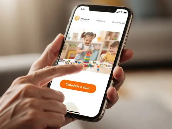
Click-to-Call Buttons
This is the single most important mobile feature for daycare websites.
Why Click-to-Call Matters
- Immediate action: Parents can call with one tap
- Emotional connection: Voice contact builds trust faster than email
- Conversion: Callers are more likely to enroll than form-submitters
- Convenience: No need to remember or type the number
Implementation
html
(555) 555-5678
On a phone, tapping this number initiates a call. On desktop, it may open Skype or FaceTime.
Placement
- Header: Top right (or top center) on every page
- Contact page: Large, prominent button
- Near forms: Alternative for parents who prefer calling
Best Practices
- Include the full number in text (some parents will write it down)
- Use a distinctive color or icon (phone icon helps)
- Make sure it's visible without scrolling (above the fold)
Mobile Contact Forms
Forms are where mobile optimization often fails. Here's how to get them right.
The Perfect Mobile Contact Form
Fields (minimum viable):
- Name (single field, not first/last)
- Email OR Phone (let them choose one)
- Message (optional)
Design:
- Full-width inputs
- Large text (18px+)
- Big submit button
- No captcha puzzles (use invisible spam protection)
What to Avoid
- Required phone AND email (friction)
- Long dropdown menus (hard to use on mobile)
- Captchas (accessibility nightmare)
- Tiny checkboxes
- Multi-step forms (for initial contact—save these for enrollment)
Post-Submission
After a parent submits, show:
- Clear confirmation ("Thank you! We'll call within 24 hours.")
- What happens next ("Our director will contact you to schedule a tour.")
- Alternative contact ("Need immediate answers? Call us at...")
Testing Your Site on Mobile
Don't assume your site works—test it.
Real Device Testing
Borrow a few phones (iPhone, Android, different sizes) and actually use your site:
- Search for your center in Google and tap the result
- Load the homepage and time how long it takes
- Find the phone number and call it
- Find the address and get directions
- Fill out the contact form (use real typing, not copy-paste)
- Browse photo galleries
- Navigate to different pages
Where did you get frustrated? Fix those points.
Emulator Testing
Use browser developer tools to simulate mobile:
- Chrome: View > Developer > Developer Tools > Toggle Device Toolbar
- Safari: Develop > Enter Responsive Design Mode
- Firefox: Tools > Browser Tools > Responsive Design Mode
This isn't as good as real device testing but catches obvious issues.
Automated Testing
- Google Mobile-Friendly Test: Free, quick check
- BrowserStack: Real device testing in the cloud
- LambdaTest: Similar to BrowserStack
Google's Mobile-First Indexing
Since 2020, Google has used mobile-first indexing—meaning it looks at your mobile site to determine your search rankings.
What This Means
- Your mobile site IS your site as far as Google is concerned
- If your mobile site is missing content that's on your desktop site, Google won't see it
- Slow mobile sites rank lower in search results
- Mobile-unfriendly sites may not rank at all
SEO Implications
- Same content on mobile and desktop (don't hide things on mobile)
- Fast mobile loading (Core Web Vitals matter)
- Structured data (helps Google understand your content)
- Mobile-friendly design (not a ranking factor, but affects user behavior)
Mobile Conversion Rates
If you need a business case for mobile optimization, here it is:
The Data
- Mobile conversion rates are 50-70% lower than desktop (industry-wide)
- This is an opportunity, not a limitation—most daycares have poor mobile sites
- Every improvement to mobile experience increases conversions
Why Mobile Converts Lower
- Distractions: Parents browsing on phones are often multitasking
- Connection issues: Slow loading causes abandonment
- Form friction: Typing on phones is harder
- Trust: It's harder to evaluate quality on a small screen
How to Improve Mobile Conversions
- Click-to-call button (converts browsing to calling)
- Simplified forms (less typing required)
- Fast loading (don't lose impatient parents)
- Clear value proposition (why choose you—instantly visible)
- Trust signals (reviews, photos, credentials—above the fold)
FAQ: Mobile Website Questions
How do I know if my site is mobile-friendly?
Use Google's Mobile-Friendly Test. Enter your URL and get instant feedback.
My site looks fine on my phone—is it mobile-friendly?
Not necessarily. What looks "fine" to you might frustrate parents. Run the Google test, and have others try to use your site on their phones.
Do I need a separate mobile website?
No. Modern best practice is responsive design—one website that adapts to all screen sizes. Separate mobile sites (m.yoursite.com) are outdated and create maintenance headaches.
How much does it cost to make my site mobile-friendly?
If your site is built on a modern platform (WordPress, Squarespace, Wix), it may already be mobile-friendly or easily fixable. A complete mobile redesign typically costs $2,000-5,000.
Will being mobile-friendly improve my Google rankings?
Yes. Google uses mobile-first indexing and considers page speed in rankings. A fast, mobile-friendly site will rank better than a slow, desktop-only site.
Should I have a mobile app for my daycare?
Probably not. Apps are expensive to build and maintain, and parents don't want to download an app just to research your center. Focus on a great mobile website instead. (Parent portals for enrolled families are a different story—those can be app-based.)
What's the difference between mobile-friendly and mobile-first?
Mobile-friendly means your desktop site has been adjusted to work on mobile. It's often an afterthought.
Mobile-first means your site was designed for mobile from the beginning, then adapted for desktop. It puts mobile users first in every decision.
Mobile-first sites load faster, navigate better, and convert more visitors because they're built for how most people actually use the web.
How do I test my site on different devices?
Free options:
- Your own phone (start here)
- Friends' phones (iPhone and Android)
- Browser developer tools (Chrome, Safari, Firefox all have device simulators)
Paid options:
- BrowserStack (test on real devices in the cloud)
- LambdaTest (similar to BrowserStack)
The key is testing on actual phones, not just simulators. Simulators don't show real-world performance on cellular networks.
What are the biggest mobile mistakes daycares make?
- Tiny text that requires zooming to read
- Unclickable phone numbers (parents have to memorize or copy)
- Forms that don't work (tiny fields, broken submit buttons)
- Slow loading (uncompressed images, cheap hosting)
- Pop-ups that cover content (and are hard to close)
- Missing hours and address (parents need this instantly)
- No clear call to action (what should they do next?)
How fast should my mobile site load?
Under 3 seconds: Good Under 2 seconds: Great Under 1 second: Excellent
Every second of delay loses visitors. Test your speed with Google PageSpeed Insights.
Do I need a separate mobile website (m.mysite.com)?
No. Modern best practice is responsive design—one website that adapts to all screen sizes. Separate mobile sites are outdated and create:
- Duplicate content (bad for SEO)
- Two sites to maintain (double the work)
- Inconsistent experiences (confusing for users)
Responsive design is simpler, better for SEO, and easier to maintain.
Mobile Testing Tools
Free Tools
| Tool | What It Does | |------|--------------| | Google Mobile-Friendly Test | Quick pass/fail test | | Google PageSpeed Insights | Speed + Core Web Vitals | | Chrome DevTools | Device simulation | | Responsively App | View multiple devices at once |
How to Test
- Open your site on your phone (use cellular data, not WiFi)
- Time how long it takes to load
- Try to find your phone number (without zooming)
- Try to call with one tap
- Try to fill out your contact form
- Navigate to different pages
- View your photos
If you struggle with any step, parents will too.
Conclusion: Mobile is the New Default
In 2026, mobile isn't a consideration—it's the foundation.
When parents search for daycare, they're on their phones. When they find you, they're on their phones. When they decide to contact you, they're on their phones.
Your website needs to work flawlessly in that context:
- Load fast on cellular data
- Display clearly on small screens
- Interact easily with thumbs
- Convert simply with click-to-call and easy forms
The centers that get this right will capture the 70% of parents who search on mobile. The ones that don't will wonder why their phone isn't ringing.
---
Ready to Go Mobile-First?
At Valley Daycare Sites, we build websites designed for the way parents actually search—on their phones, in short bursts, with high expectations. Every site we create is mobile-first, fast, and optimized for conversions.
Get your free sample homepage at valleydaycaresites.com
Because in 2026, if your website doesn't work on mobile, it doesn't work.
Ready to Transform Your Daycare Website?
Get a free sample homepage designed specifically for your daycare. No upfront cost, no pressure.
Get Your Free Sample

