What Parents Notice First on a Daycare Website (And Why It Matters)
Discover the key elements parents evaluate in the first 3 seconds on your daycare website. Learn what makes them stay or leave.

What Parents Notice First on a Daycare Website
When a parent lands on your daycare website, you have exactly 3 seconds to make an impression. That's it. In those three seconds, they're not reading your carefully crafted mission statement or admiring your curriculum details. They're making snap judgments based on what they see, feel, and experience.
And if something feels off? They're gone. Back to Google. On to your competitor.
This guide breaks down exactly what parents notice first—and how to make sure every element works in your favor.
The 3-Second First Impression: Why It Matters
Parents don't browse daycare websites the way they browse Amazon. They're stressed, time-pressed, and emotionally charged. They're leaving their child somewhere for 8+ hours a day. The stakes feel enormous.
Research shows that 94% of first impressions are design-related. Not content. Not your degrees or certifications. Design.
What Happens in Those 3 Seconds

Within the first glance, parents unconsciously evaluate:
- Is this place professional? A modern, clean site says "we have our act together." A dated, cluttered site says "we might cut corners with your child too."
- Is this place trustworthy? Photos of real children, real staff, and real spaces create immediate trust. Stock photos scream "we're hiding something."
- Is this place for people like me? Parents want to see diversity in age, ethnicity, and family structures. If your photos look nothing like their family, they may keep looking.
- Can I find what I need? If contact info, hours, or location are buried, they'll assume you're hard to work with.
- Is this place safe? Professional design implies professional standards. A sloppy website suggests sloppy practices.
The Psychology of Parent Decision-Making
Choosing childcare is one of the most emotional decisions a parent makes. Understanding their mindset helps you design for it.
The emotional weight:
- Parents feel guilt about leaving their child
- They worry about safety, nutrition, development, socialization
- They're comparing you to staying home (even if that's not realistic)
- They want reassurance, not sales pitches
What they're really asking:
- "Will my child be safe here?"
- "Will my child be happy here?"
- "Will my child be loved here?"
- "Can I trust these people?"
Your website needs to answer these questions emotionally, not just logically. Facts matter, but feelings drive decisions.
The comparison trap: Parents don't evaluate your website in isolation. They have 10+ tabs open. They're comparing you to other centers in real-time. Every friction point on your site makes your competitor look better by comparison.
The Mobile Factor
Here's the thing: most parents are browsing on their phones—during lunch breaks, while waiting in line, between meetings. If your site doesn't work flawlessly on mobile, that 3-second window shrinks to 1 second.
A site that's hard to navigate on a phone tells parents: "We haven't kept up with the times." And if you haven't kept up with website technology, what else are you behind on?
Mobile usage statistics:
- 70% of initial daycare searches happen on mobile
- Parents browse during "micro-moments" (waiting in line, during commute, lunch break)
- Mobile visitors are 5x more likely to leave if a site isn't mobile-optimized
- Click-to-call buttons increase contact rates by 40%
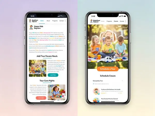
Visual Trust Signals: The Foundation of Credibility
Trust isn't built with words. It's built with visuals. Here's what parents look for—and how to deliver.
Real Photos of Your Space
Parents want to see where their child will spend their days. This includes:
Classrooms:
- Age-appropriate materials visible on shelves
- Clean floors and organized storage
- Natural light (if possible)
- Children's artwork on walls
- Comfortable reading corners
- Clear sightlines for supervision
Outdoor play areas:
- Safe, age-appropriate equipment
- Shaded areas for hot days
- Soft surfacing under equipment
- Variety of play options (climbing, riding, sand, water)
- Secure fencing
Meal areas:
- Clean tables and proper seating
- High chairs for infants
- Visible food storage and prep areas
- Posted menus
Nap spaces:
- Individual cribs or cots
- Proper bedding
- Dim lighting or blackout curtains
- Sound machines or white noise
- Supervision visible
Pro tip: Avoid the temptation to only show "perfect" staged photos. A little bit of realistic mess (toys on the floor, art on the walls) actually increases trust. It shows real life at your center.
Real Photos of Staff
Anonymous caregiving is terrifying. Parents want to see who will care for their child.
What to include:
- Warm, genuine smiles (not forced, corporate headshots)
- Staff interacting with children (not just standing alone)
- Diverse representation that reflects your community
- Credentials subtly visible (a diploma on the wall, a name badge)
- First names and brief bios ("Ms. Jennifer has been teaching 3-year-olds for 12 years. Her favorite part of the day is circle time singing.")
Types of staff photos:
- Individual portraits with warm expressions
- Candid shots of teachers helping children
- Group team photos showing unity
- Leadership/director photos prominently featured
- Staff training and professional development moments
What to avoid:
- Sunglasses or hats hiding faces
- Dated photos (update every 2 years)
- Stock photos or obviously staged images
- Staff photos without names or context
Testimonials With Specifics
Generic testimonials like "Great daycare!" are worthless. Parents are savvy. They want:
- Specific details ("My daughter was nervous about starting, but Ms. Rosa made her feel welcome from day one...")
- Parent names and photos (with permission)
- Variety of ages/programs represented
- Video testimonials if possible (these are incredibly powerful)
- Google Review integration (shows authenticity)
How to get great testimonials:
- Ask happy parents at pickup time
- Send a simple email request with guiding questions
- Make it easy (provide a link to your Google review page)
- Ask for specifics ("What was your biggest worry before enrolling? How did we address it?")
Certifications and Accreditation Badges
If you're NAEYC-accredited, state-licensed, or have other credentials, display them prominently. But make sure they're:
- Up to date (an expired license badge is worse than no badge)
- Real (link to verification pages if possible)
- Visible (don't bury them in a footer)
- Explained (parents may not know what NAEYC means)
Color Psychology and Design Elements
The colors and design choices on your website send subconscious messages.
Colors That Work for Daycares
Warm colors (orange, yellow, red):
- Convey energy, warmth, and friendliness
- Use for CTAs (Schedule a Tour buttons)
- Don't overuse—can feel overwhelming
Cool colors (blue, green, purple):
- Convey trust, calm, and professionalism
- Good for headers, backgrounds
- Blue is the most trusted color in business
Neutral colors (white, gray, beige):
- Convey cleanliness and simplicity
- Use for backgrounds and breathing room
- White space makes content more readable
What to avoid:
- Too many colors (feels chaotic)
- Neon or harsh colors (feels unprofessional)
- Dark, gloomy palettes (feels unwelcoming)
Typography Choices
Your font choices matter more than you think.
Best practices:
- Use 1-2 fonts maximum
- Sans-serif fonts for web (easier to read on screens)
- Minimum 16px for body text
- Clear hierarchy (headings bigger than body)
- High contrast (dark text on light background)
Navigation That Works
If parents can't find information, it doesn't exist on your site.
Essential Navigation Elements
Primary navigation (top level):
- Home (always include)
- Programs (by age or type)
- About Us (mission, history, team)
- Gallery or Photos
- Parent Resources (forms, handbook, portal)
- Contact or Schedule a Tour
Secondary navigation (footer):
- Hours and location
- Phone number (clickable)
- Social media links
- Privacy policy
- Employment opportunities
Navigation Best Practices
- Keep it simple (5-7 items maximum)
- Use clear labels ("Programs" not "What We Offer")
- Be consistent (same menu on every page)
- Highlight current page (so parents know where they are)
- Mobile-friendly (hamburger menu on phones)
The "Three-Click Rule"
Parents should be able to find any information within three clicks. Test this:
- Can I find infant rates in 3 clicks?
- Can I find the director's name in 3 clicks?
- Can I schedule a tour in 3 clicks?
- Can I find the address in 3 clicks?
If the answer is no for any of these, reorganize your navigation.
Mobile Experience: The New First Impression
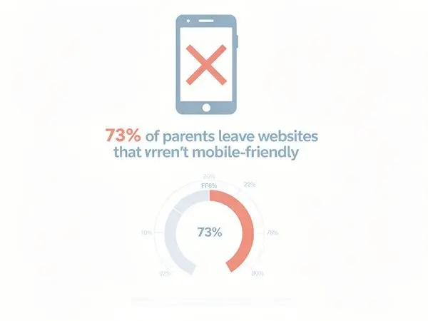
Let's be blunt: if your website isn't mobile-friendly in 2026, you're losing parents before they even call.
What "Mobile-Friendly" Actually Means
It's not just about "fitting on a phone screen." A truly mobile-friendly site:
- Loads in under 3 seconds on cellular data
- Has large, tappable buttons (minimum 44x44 pixels)
- Displays text at readable sizes without zooming (16px+)
- Shows click-to-call phone numbers
- Has simplified navigation (hamburger menus are fine)
- Avoids pop-ups that cover the screen
- Uses mobile-optimized forms (large input fields)
The Mobile Mistake That Kills Inquiries
The biggest sin: a contact form that's impossible to fill out on a phone.
If a parent has to pinch-zoom to see form fields, or if the submit button is cut off, or if the form requires typing in tiny boxes—they'll quit.
Solution: A simple "Request a Tour" form with just 3 fields: Name, Email/Phone, Child's Age. That's it. Get them in the door first.
Testing Your Mobile Experience
The phone test:
- Open your site on your phone (use cellular data, not WiFi)
- Can you find the phone number in 5 seconds?
- Can you call with one tap?
- Can you fill out the contact form easily?
- Do photos load quickly?
- Can you navigate without zooming?
If you struggle with any of these, so will parents.
Contact Info Visibility: Don't Make Them Hunt
Your phone number, address, and email should be visible on every page. No exceptions.
The Header Rule
Your phone number belongs in the header. It should be:
- Clickable on mobile (tap to call)
- Large enough to read without squinting
- In a contrasting color that stands out
- Accompanied by a phone icon for quick recognition
Address and Map
Parents want to know: "Is this on my way to work?" Include:
- Full street address (not just "near downtown")
- Embedded Google Map showing your location
- Parking information (is there a lot? Street parking? Drop-off zone?)
- Landmarks ("Next to the library," "Behind the grocery store")
- Major cross streets for easy navigation
Hours of Operation
This seems obvious, but you'd be surprised how many centers bury their hours. Put them:
- In the header or footer
- On the homepage
- On the contact page
- In your Google Business Profile
Include early drop-off and late pick-up options if you offer them. This is a huge differentiator for working parents.
Multiple Contact Options
Different parents prefer different contact methods. Offer:
- Phone (for immediate questions)
- Email (for detailed inquiries)
- Contact form (for tour scheduling)
- Text/SMS (if you have this capability)
- Social media messaging (Facebook Messenger, Instagram DM)
Speed and Professionalism: The Silent Judgment
A slow website sends a message: "We don't prioritize modern infrastructure."
Why Speed Matters
- 53% of mobile users abandon sites that take longer than 3 seconds to load
- Slow sites rank lower in Google (meaning parents won't even find you)
- A slow site implies slow service (fair or not, this is the perception)
- Every 1-second delay reduces conversions by 7%
Quick Speed Fixes
- Compress images (large photos are the #1 cause of slow sites)
- Use a modern hosting provider (not budget shared hosting)
- Minimize plugins (every plugin adds load time)
- Enable caching (returning visitors load faster)
- Use a CDN (content delivery network)
Common Mistakes That Drive Parents Away
Even great daycares make these website mistakes:
1. Stock Photos Everywhere
You know those photos of perfectly diverse, impossibly happy children in spotless, colorful rooms? Parents know they're fake. And they wonder: "What are they hiding?"
Fix: Invest in a professional photographer for one day. The photos will last you years.
2. Outdated Information
"Summer camp registration now open!"—in October. "Meet our new director!"—from 2023.
Outdated information screams neglect. If you can't keep your website current, can you keep my child safe?
Fix: Schedule monthly website audits. Put it on the calendar.
3. Broken Links and Pages
Clicking a link that goes nowhere is frustrating. It also looks unprofessional.
Fix: Use a link checker tool monthly. Fix broken links immediately.
4. No Social Proof
No testimonials. No reviews. No photos of real families.
Fix: Ask happy parents for Google reviews. Display them prominently.
5. Hidden Pricing
Parents understand that daycare pricing varies by age and schedule. But if you hide all pricing information, they'll assume you're either:
- Embarrassingly expensive, or
- Going to pressure them into a hard sell
Fix: At minimum, list a price range or starting point. "Infant care starting at $X/week."
6. Autoplay Videos or Music
Nothing makes parents close a tab faster than unexpected audio. Especially if they're browsing at work or while their child naps nearby.
Fix: Never autoplay audio. If you have video, let users choose to play it.
7. Tiny Text and Poor Contrast
If parents have to squint to read your content, they won't. They'll leave.
Fix: Use 16px+ font size and high contrast (dark text on light background).
Quick Wins Checklist: What to Fix Today

If you only have 30 minutes to improve your site, do these:
- [ ] Phone number in header (clickable on mobile)
- [ ] Real photos (replace at least 3 stock photos with real ones)
- [ ] "Request a Tour" button (on homepage, above the fold)
- [ ] Hours of operation (visible on every page)
- [ ] Google review link (make it easy to leave reviews)
- [ ] Fix broken links (run a quick check)
- [ ] Update copyright year (if it says 2024 or earlier, you look inactive)
- [ ] Check mobile experience (test on your phone)
- [ ] Compress images (if site loads slowly)
FAQ: What Parents Ask Most
How do I know if my website is mobile-friendly?
Open it on your phone. Try to navigate. If you have to zoom, scroll sideways, or tap tiny links, it's not mobile-friendly. Google also offers a free Mobile-Friendly Test.
Should I list prices on my website?
Yes. At minimum, provide a range or starting price. Parents who can't afford your rates appreciate knowing upfront, and qualified parents won't be scared off.
How often should I update photos?
At least twice a year. Seasonal photos (fall activities, summer camp) show that your site is active and your program is engaging.
What if I don't have testimonials yet?
Start asking happy parents. Most are willing to write a few sentences if you make it easy. Send them a simple email: "We're updating our website. Would you be willing to share a brief testimonial about your experience?"
How many photos should I have?
Quality over quantity. 10-15 excellent, authentic photos are better than 50 mediocre ones. Show different spaces, different ages, and different activities.
Should I have a blog?
Only if you'll actually maintain it. An abandoned blog (last post: 2+ years ago) looks worse than no blog at all.
How do I get more Google reviews?
Ask happy parents directly. Make it easy by providing a direct link to your Google review page. The best times to ask: after a positive moment (first month anniversary, milestone achievement, heartfelt thank you).
What's the most important page on my website?
The homepage gets the most traffic, but the contact/programs pages drive conversions. All three need to be excellent.
Should I include staff qualifications?
Yes, but don't make it feel like a resume. Brief mentions like "Ms. Maria has her CDA and 8 years of experience with toddlers" build credibility without overwhelming.
How do I choose which photos to feature on the homepage?
Prioritize:
- One warm, inviting shot of your space (classroom or entrance)
- One staff-child interaction photo (shows nurturing)
- One outdoor/play photo (shows activity and fun)
- Avoid photos that are too similar or show the exact same space from different angles
What if my center isn't photogenic?
Every center has photogenic spots. Focus on:
- Clean, organized areas
- Natural light (near windows)
- Children's artwork on walls
- Cozy reading corners
- Outdoor spaces (even small playgrounds photograph well)
You can also make small improvements before photographing: fresh flowers, organized shelves, bright throw pillows.
Conclusion: Your Website Is Your First Impression
For most parents, your website is their first interaction with your daycare. Before they step foot in your building, before they meet your staff, before they see your classrooms—they've already formed an opinion based on your website.
That opinion is formed in 3 seconds.
Make those seconds count.
Show them professionalism. A clean, modern, fast website. Show them trust. Real photos, real testimonials, real people. Show them convenience. Easy contact info, mobile-friendly design, clear next steps.
Because the parents who visit your website? They're not just looking for childcare. They're looking for peace of mind. They're looking for a partner in raising their child.
Your website should tell them: You've found the right place.
---
Ready to Transform Your Daycare Website?
At Valley Daycare Sites, we specialize in creating professional, parent-converting websites for childcare centers. We know what parents look for, and we know how to showcase what makes your center special.
Get your free sample homepage at valleydaycaresites.com
No commitment. No pressure. Just a glimpse of what your center could look like online.
Because every parent deserves to find the perfect daycare—and every daycare deserves to be found.
Ready to Transform Your Daycare Website?
Get a free sample homepage designed specifically for your daycare. No upfront cost, no pressure.
Get Your Free Sample

