Why an Outdated Website Can Hurt Daycare Enrollment
Understanding the hidden costs of an old website and what you can do about it to protect your enrollment numbers.

Why an Outdated Website Hurts Daycare Enrollment
You've spent years building your daycare. You've earned the trust of families, hired caring staff, and created a warm, safe environment where children thrive. But there's one critical aspect of your business that might be working against you—and you may not even realize it.
Your website.
If your daycare website looks like it was built five or ten years ago, you're silently losing families to competitors every single day. Parents today make decisions differently than they did in the past. They expect professionalism, speed, and ease of use. And when they don't get it from you, they move on to the next option.
This isn't about having the flashiest design or the most expensive technology. It's about meeting modern parents where they are and showing them that your daycare is as professional and current as the care you provide.
Let's explore exactly how an outdated website is hurting your enrollment—and what you can do about it.
The Hidden Cost of an Old Website

Most daycare owners think about expenses in tangible terms: rent, salaries, supplies, insurance. But there's an invisible bleeding wound in many daycare budgets—the opportunity cost of an outdated website.
Consider what happens when a parent lands on your site:
- First impressions form in 0.05 seconds — That's five hundredths of a second. Before they read a word, they've already decided if your business looks professional and trustworthy.
- 59% of parents won't return if they have a poor first experience with your website. They simply move to the next result on Google.
- Mobile users leave if loading takes more than 3 seconds — And 60% of parents are searching for childcare on their phones.
The Math Behind the Loss
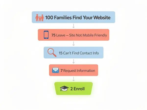
Let's put real numbers to this problem. Imagine your website receives 200 visitors per month—this is conservative for most daycares. With good conversion, you might expect 10-15 families to inquire each month. But with an outdated site?
Here's what happens:
- 40% bounce rate from poor design — 80 visitors leave immediately
- 20% abandon due to slow loading — 40 more gone
- 30% don't trust an outdated look — 60 families don't inquire
That leaves you with perhaps 2-3 inquiries instead of 10-15. Over a year, that's 72-120 lost enrollment opportunities. At an average of $600-$1,200 per child per month, you're losing $43,200 to $144,000 annually just because your website looks outdated.
But the damage goes deeper than lost enrollments:
- Referral chain broken — Families who do enroll notice your outdated site. When friends ask about your daycare, they don't take you seriously as a recommendation.
- Higher marketing costs — You have to spend more on ads or flyers to get the same number of inquiries because your website isn't converting visitors.
- Perception of overall quality — If your website looks neglected, parents assume your facilities and care have been neglected too.
An outdated website isn't just a cosmetic issue. It's a revenue leak you can afford to fix.
What "Outdated" Really Means to Parents
You might think your website is fine. It's had the same design for six years—it worked well then, so why would it be a problem now?
The truth is, what "good" meant in 2018 or 2019 is nothing like what it means in 2026. Parents have been trained by years of excellent digital experiences to expect certain standards. When your website doesn't meet them, you're sending a signal you didn't intend to send.
The Five Signs Your Website Feels Outdated to Parents
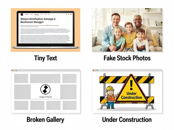
1. Visual Design Looks Stale
Outdated websites often feature:
- Boxy layouts with heavy borders and shadows
- Oversaturated or clashing color schemes
- Low-resolution images with visible pixelation
- Decorative elements that add visual noise rather than value
- Typography from a decade past (think Comic Sans, Times New Roman, or over-italicized text)
Modern parents have seen beautiful websites. They've used sleek apps for banking, shopping, and entertainment. When they land on your daycare site with boxy frames and pixelated photos, they experience "design dissonance"—a subtle sense that something doesn't feel right.
2. Navigation Is Confusing
Parents shouldn't need a puzzle map to find your program details. Yet outdated sites commonly feature:
- Menu items hidden in dropdowns within dropdowns
- Inconsistent link styles that don't indicate what's clickable
- No search bar to find information quickly
- Important links buried three pages deep
- Broken links that lead to 404 errors
When navigation fails, parents assume you lack attention to detail—and they worry the care your children receive might suffer from the same lack of polish.
3. Content Feels Generic or Stale
An outdated site often has:
- Boilerplate text that could describe any daycare anywhere
- No mention of your unique philosophy or approach
- Outdated contact information or hours that have changed multiple times
- References to programs or events from years ago
- No photos of actual children in your care (or just the same recycled images every year)
Parents today want authenticity. They want to see your actual space, your real children, and your genuine personality. Generic content suggests you have nothing unique to offer.
4. Zero Social Proof
Modern websites prominently feature:
- Testimonials from current families
- Photos and videos from your daily operations
- Links to active social media accounts
- Star ratings from review platforms
- Certifications, awards, or accolades
Outdated sites often have none of this. In a world where parents heavily rely on reviews before making decisions, having no visible proof of satisfaction is a massive credibility gap.
5. No Call-to-Action Clarity
How exactly should a parent contact you? Do you want them to:
- Fill out a form?
- Call you?
- Text you?
- Book a tour through an online calendar?
- Email you?
Outdated websites often don't say clearly. Maybe there's a small "Contact Us" link buried in the footer. Maybe the phone number is in tiny font. Maybe the form doesn't work on mobile.
When parents have to hunt for the next step, many just give up and move to the next daycare on the list.
The Trust Gap
Here's what happens in a parent's mind when they land on an outdated site:
> "Hmm, this looks old. Maybe they haven't updated their policies in a while. Maybe they're not tech-savvy. What else haven't they updated? Their safety procedures? Their curriculum? Their facility maintenance?"
That's not what you intended to communicate. But that's exactly what outdated websites communicate.
Mobile Problems That Kill Inquiries
More than 60% of parents searching for daycare do so on their phones. Some research suggests the actual number is closer to 70% or more. After a long day at work, they're scrolling through Google while waiting for their own child to finish soccer practice. At 2 AM when they can't sleep, they're looking on their phone in bed. Between meetings, they're checking options during lunch breaks.
Mobile-first is no longer optional. It's non-negotiable.
Yet countless daycares still have websites that fail miserably on mobile. Here's how these problems directly kill your enrollment.
The Mobile Experience Checklist: Is Your Site Failing?
Problem #1: Everything Is Too Small to Read or Click
- Text is so small parents need to squint or zoom
- Buttons are tiny and hard to tap accurately
- Links run so close together you can't tap without errors
- Navigation menus disappear without a hamburger icon
What this costs you: Immediate frustration, and parents leaving to find another daycare.
Problem #2: Horizontal Scrolling
- Content wider than the screen forces sideways scrolling
- Images cut off or push content beyond the visible area
- Forms overflow the screen edge
What this costs you: Confusion, the feeling that your site is broken or poorly built.
Problem #3: Pop-ups and Intrusive Overlays
- Ad banners that block content until closed
- Email capture prompts that appear immediately
- Cookie consent banners covering the entire screen
- Chat widgets that don't disappear or minimize on mobile
What this costs you: 53% of mobile users abandon sites with intrusive pop-ups. They won't deal with friction.
Problem #4: Forms That Can't Be Filled Out
- Input fields are too small to type into
- Autocomplete doesn't work, forcing manual entry
- CAPTCHA puzzles are impossible on small screens
- Submit buttons disappear when the keyboard pops up
What this costs you: Lost inquiries. Parents want to contact you, but they can't.
Problem #5: Slow Load on Mobile
- Unoptimized images that take 10+ seconds to load
- Heavy scripts blocking page rendering
- No caching or lazy loading
- Poor hosting that bogs down on mobile networks
What this costs you: 40% of users leave if a page takes more than 3 seconds to load. On slow mobile connections, "slow" happens fast.
The Mobile Enrollment Funnel Killers
Let's trace what happens when a parent visits your site on their phone:
- They search for "daycare near me" on their phone while waiting in line at the grocery store.
- Your site appears in results. They click it.
- Your homepage loads slowly. It displays a rotating banner that's larger than the screen. Half of it is cut off.
- They try to zoom in to read the small "About Us" section.
- They want to contact you, but the "Contact" link is buried in a footer below the fold.
- They try to call by tapping your phone number, but it's not clickable—just plain text. They have to manually type it in.
- They give up and click the next daycare in the search results.
That's you just lost a real, motivated family looking for childcare RIGHT NOW.
Mobile Optimization Isn't Optional Anymore
Google ranks mobile-friendly websites higher. In fact, for local searches like "daycare near me," mobile optimization is a critical ranking factor. If your site isn't mobile-optimized:
- You rank lower on Google
- You get fewer visits from motivated parents
- Those who do visit leave immediately
- Your inquiry rates plummet
It's not just about appearing in search results—it's about converting the parents who find you. And mobile optimization is at the absolute core of that.
Speed & Loading Issues
In 2026, parents have no patience for slow websites. Every second your site takes to load costs you inquiries. Every moment of spinning loading wheels costs you enrollments.
The Speed Reality Check
Here are some hard truths about speed:
- 40% of users abandon a website if it takes more than 3 seconds to load
- Google considers page speed a ranking factor—slow sites rank lower
- 53% of mobile sessions are abandoned after 3 seconds of loading
- Every 1-second delay in page load time reduces conversions by 7%
- Customers are 74% more likely to return to a fast-loading site
These aren't just statistics. These represent real families who wanted to enroll your children but couldn't be bothered to wait.
Common Speed Killers in Daycare Websites
1. Unoptimized Images
Daycare websites thrive on images—photos of your facility, your activities, your happy children. But those images are often uploaded straight from cameras or phones without optimization:
- Your "happy children playing.jpg" might be 5MB in size
- Multiple photos per page add up to megabytes
- No compression, no proper formats (WebP, AVIF)
- No responsive images that serve smaller versions to mobile devices
Result: Loading times of 10+ seconds instead of 2-3.
2. Too Many Plugins and Extensions
Adding one plugin after another to handle forms, galleries, social feeds, analytics, and chat can create massive overhead:
- Each plugin loads its own scripts
- Plugins conflict with each other, creating redundant code
- Old plugins never uninstalled leave ghost code
- Some plugins make external API calls that slow down your page
Result: A bloated site that chugs under the weight of digital debris.
3. Poor Hosting Infrastructure
Your website is probably hosted on:
- Cheap shared hosting with 100+ other sites fighting for resources
- No caching mechanisms in place
- No Content Delivery Network (CDN) to serve content from locations closer to visitors
- Slow database queries and inefficient server configurations
Result: Your site loads at the mercy of whoever else is on your shared server.
4. No Browser Caching
Every time a parent revisits your site:
- All images and scripts re-download from scratch
- No leverage of browser cache
- First-time visitors suffer, but return visitors suffer more
Result: Frustrated parents abandoning a site that seems to keep failing even after the first visit.
5. Render-Blocking Resources
Old websites often load CSS and JavaScript files in ways that block page rendering:
- CSS in the body instead of the head
- JavaScript that runs before content displays
- External widgets (chat, analytics, forms) that delay the entire page
Result: White screens for 5-10 seconds while your website prepares.
The Speed-Enrollment Connection
Let's put this in daycare-specific terms. Every 1 second your site takes to load beyond 3 seconds:
- You lose 7% of potential inquiries
- Those families move to a faster competitor
- You damage brand credibility (slow = unprofessional)
With 200 monthly visitors, that's:
- 14 fewer inquiries per second of delay (based on a 7% conversion drop)
- Over a year, that's 168-336 lost enrollment conversations
- At a 20% enrollment rate from inquiries and $800 average monthly tuition, you've lost $13,440-$26,880 annually per second of delay
That's not theoretical. That's money walking out the door.
Testing Your Own Site Speed
Run your own website through Google's PageSpeed Insights. Chances are, you'll see:
- A mobile score below 50/100 (anything below 75 is problematic)
- A desktop score that might be passable, but doesn't matter if mobile fails
- Recommendations for image optimization, caching, and script reduction
If your score is below 75 on mobile, your daycare website is actively hurting your enrollment.
Design Trends from 2015 vs 2026
Design isn't just about aesthetics. It's about communication, trust, and meeting expectations. Parents in 2026 have different expectations than parents in 2015. When your website reflects 2015 design, you're signaling to parents that your daycare hasn't evolved either.
The Visual Language Gap
2015 Website Design Characteristics:
- Boxy layouts with visible borders — Heavy use of containers with 1px solid borders, visible dividers between sections
- Flat but dated color schemes — Bright primary colors (red, blue, yellow) without nuance or harmony
- Stock photography overload — Generic photos of "generic children" that could be from any daycare anywhere
- Heavy use of clip art — Cartoons of books, pencils, and colorful stars decorating random sections
- Limited responsive design — Mobile support is an afterthought if it exists at all
- Dense text blocks — Walls of text with minimal white space
- Drop shadows and gradients everywhere — Every button and box has a shadow. Gradients on everything.
- Small, pixelated icons — Low-resolution icons that blur when zoomed
- Flash or banner animations — Rotating banner at the top (if it runs at all)
2026 Website Design Standards:
- Clean, spacious layouts — Generous white space that guides the eye naturally
- Harmonious, sophisticated color palettes — Colors chosen to evoke calm, trust, and warmth (soft pastels, warm neutrals with accent colors)
- Authentic photography — Real photos of your actual facility, staff, and happy children
- Subtle, purposeful animations — Micro-interactions that feel modern without being distracting
- Fully responsive, mobile-first design — Built for mobile, then enhanced for desktop
- Scannable content organization — Short paragraphs, bullet points, clear headers, visual hierarchy
- Flat or subtle depth treatment — Clean buttons, minimal shadows, modern UI elements
- High-resolution, optimized vector graphics — Icons that scale perfectly on any screen
- Purposeful motion — Subtle fade-ins, smooth page transitions, interactive galleries
Why This Visual Gap Matters
Let's compare what parents feel when they land on these different designs:
2015 Design Parent Experience:
- "This looks old." — Immediate perception of outdatedness
- "Do they still operate this way?" — Questioning of overall quality
- "Where do I find information?" — Confused by cluttered layout
- "Is this even professional?" — Doubt about seriousness
- "I should check another daycare..." — Quick exit to search results
2026 Design Parent Experience:
- "This looks professional." — Trust begins building immediately
- "They care about details." — Assumption of quality care follows
- "All the information is clear." — Easy navigation builds confidence
- "These photos look real and warm." — Emotional connection forms
- "I'd like to learn more." — Engagement deepens, inquiry likely
The Psychology of Design Trust
Parents make emotional decisions about daycare, justified by logical ones. Design hits that emotional button first. A modern, professional design signals:
- You pay attention to detail — If you care about your website, you care about everything else
- You're financially stable — Professional design suggests you're not struggling to make ends meet
- You understand modern standards — You're not stuck in the past; you invest in improvement
- You value your reputation — You've invested in how you're perceived online
- You respect parents' time — Thoughtful design shows you consider user experience
An outdated design signals the opposite. It doesn't matter how wonderful your care is—the design is creating doubt before you even meet parents.
Competitor Comparison (They Have Better Sites)
Here's an uncomfortable truth: Your competitors likely have better websites than you do.
And it's not just about design. It's about the complete experience. While you've been focusing on running your daycare, they've been investing in how parents find and evaluate you online.
The Modern Competitor Website Checklist
When parents search for "daycare near me," the ones that rank well probably have:
Strong First Impressions
- Professional hero images with genuine photos of happy children
- Clear value proposition in the first 5 seconds
- Instant "trust signals" (licensing, reviews, certifications)
Exceptional Mobile Experience
- Fast loading on all devices (under 3 seconds)
- Intuitive touch-friendly navigation
- Click-to-call buttons everywhere
- No zooming or horizontal scrolling
Clear Calls-to-Action
- Prominent "Schedule A Tour" buttons
- Easy contact forms with minimal fields
- Live chat for immediate questions
- Calendar integration for self-scheduling tours
Content That Answers All Questions
- Detailed program information with pricing
- FAQ section addressing common concerns
- Staff bios with professional photos
- Photo galleries showing daily activities
- Downloadable brochures and resource guides
Social Proof Everywhere
- Testimonials from current families (with permission)
- Links to Yelp, Google Reviews, Facebook
- Star ratings on the homepage
- Before-after stories and enrollment success stories
SEO Optimization
- Ranking for local keywords
- Blog posts with helpful parenting advice
- Location pages for multiple service areas
- Proper meta titles and descriptions
What This Means for You
When parents compare you to competitors, the comparison isn't happening in your facility. It's happening on their phones, and your competitor's website is winning the digital arms race.
Here's the enrollment reality:
- Competitor A has a beautiful, mobile-optimized site that loads in 2 seconds — Parents trust them immediately and schedule a tour
- Competitor B has an outdated, slow site — Parents abandon quickly, but they don't leave a bad review—they just move on
- You might be Competitor B — You lose parents silently, without even knowing competitors are benefiting
The Competitive Advantage Gap
The gap widens over time. While you're losing families:
- Competitors gain testimonials — More families mean more reviews
- They refine their messaging — Feedback loops improve their approach
- They invest in growth — More enrollment funds more marketing
- They dominate local search — Google favors engaged, high-converting sites
It's a compounding effect working against you. The longer you wait, the further behind you fall.
What to Do About It
Don't let this be discouraging—let it be motivating. You have advantages too:
- You know your actual business — Competitors are generic; you're authentic
- Your care quality is real — Competitors might have pretty sites, but you have genuine excellence
- Modern design can showcase your unique value — Your website can highlight what makes you different
- It's never too late to catch up — Many daycares are still behind; you can be the exception in your area
Enrollment Stats: Good Site vs Bad Site
Let's look at the hard numbers. What's the actual difference between a good daycare website and a bad one?
Industry Benchmarks for Daycare Websites
With an Outdated Website:
- Bounce rate: 70-80% (visitors leave immediately)
- Time on site: 45-60 seconds
- Pages per session: 1.2-1.5
- Inquiry conversion: 1-3%
- Phone call conversion: 5-10% of inquiries
- Enrollment conversion: 15-20% of scheduled tours
With an Optimized, Modern Website:
- Bounce rate: 40-50%
- Time on site: 2-3 minutes
- Pages per session: 3-5
- Inquiry conversion: 5-8%
- Phone call conversion: 25-35% of inquiries
- Enrollment conversion: 40-50% of scheduled tours
Real-World Enrollment Impact
Let's say you and a competitor both get 300 visitors per month:
Your Outdated Website:
- 75% bounce rate = 225 visitors leave immediately
- 75 visitors remain
- 2% inquiry rate = 1.5 inquiries per month (round to 2)
- 10% call rate = 0.2 calls per month (round to 0-1)
- 15% enrollment from tours = 0-0.3 enrollments per month
Competitor's Modern Website:
- 45% bounce rate = 135 visitors leave
- 165 visitors remain engaged
- 6% inquiry rate = 10 inquiries per month
- 30% call rate = 3 calls from inquiries
- 2 tours scheduled from calls/inquiries
- 45% enrollment from tours = 1.8 enrollments per month
The Result: Your competitor gets 6x more enrollments from the same number of website visitors.
Annual Revenue Impact
At $800 per child per month:
- Your outdated site: 0-3 enrollments/year = $0-$28,800 annually
- Competitor's modern site: 1.8 enrollments/month × 12 = $17,280 per enrollment × 12 = ~$20,700/month run-rate = ~$250,000 annual impact
Even with conservative numbers, a modern website could add $100,000-$200,000 in annual recurring revenue for your daycare.
The Lifetime Value Multiplier
But the impact doesn't stop at monthly enrollment:
- Each enrolled child pays average 24 months = $19,200 lifetime value at $800/month
- Referral rate improves with credibility — Families who trust your online presence refer more friends
- Word-of-mouth amplifies — Professional sites get shared and discussed positively
A single enrollment from website optimization can be worth thousands over its lifetime. Better conversion rates mean compounding growth year after year.
What the Data Really Shows
The pattern is clear:
Good websites: Lower bounce rates, higher engagement, better conversion, more referrals, sustained growth
Bad websites: High abandonment, low trust, minimal conversion, stagnant enrollment, invisible online
Your website quality correlates directly with your enrollment success. The two aren't separate issues—they're one and the same.
Quick Fixes vs Full Redesign

You might be thinking: "Okay, I need to fix my website, but I don't have thousands of dollars to invest." Good news—you don't need to start with a full redesign.
Here's the reality: You can make significant improvements incrementally. Start with quick wins that build momentum, then invest in a comprehensive solution when you're ready.
Quick Fixes You Can Make Now (Cost: $0-$200)
1. Optimize Your Images
- Compress all images using free tools like TinyPNG or Squoosh
- Resize hero images to maximum 1920px wide
- Convert images to WebP format
- Remove unused images
2. Speed Up Your Site
- Install a caching plugin (WP Super Cache or W3 Total Cache for WordPress)
- Enable browser caching on your hosting
- Minimize CSS and JavaScript
- Delay loading of non-critical scripts
3. Fix Mobile Issues
- Make sure your site is responsive (test on your phone)
- Add click-to-call phone buttons
- Ensure all links and buttons are thumb-sized (44px minimum)
- Remove pop-ups that block content on mobile
4. Add Clear Calls-to-Action
- Put your phone number prominently in the header
- Add "Schedule a Tour" buttons above the fold
- Create a simple contact form with 4-5 fields max
- Remove hidden contact information from footers
5. Write Fresh, Honest Content
- Update your "About Us" with your real story
- Add genuine photos of your facility
- Write a real description of daily activities
- Update any outdated information
These quick fixes can improve your site's effectiveness by 30-50% with minimal investment.
Strategic Investments for Long-Term Growth (Cost: $500-$5,000+)
When you're ready to go further:
1. Custom Redesign
A professional redesign focused on your daycare's unique value can:
- Increase conversion by 50-200%
- Reduce support questions by creating clear FAQ sections
- Improve mobile experience dramatically
- Position you ahead of competitors
2. Ongoing Content Strategy
- Regular blog posts help with local SEO
- Program updates keep information fresh
- Seasonal content (summer programs, back-to-school) builds engagement
3. Technical Optimization
- Professional hosting that's actually fast
- SSL certificates for security
- CDN integration for global speed
- Regular backup and security updates
4. Conversion Optimization
- A/B testing of headlines and calls-to-action
- Analytics tracking to measure improvements
- Heat maps showing where parents click
- Funnel optimization from visitor to enrollment
Getting Started Without Breaking the Budget
If you need comprehensive help but limited budget:
Option 1: Phased Approach
- Month 1: Quick fixes, content updates, image optimization
- Month 2: New hero section, improved mobile experience
- Month 3: Full homepage refresh
- Month 4+: Individual page redesigns
Option 2: Professional Services Tailored for Daycares
- Specialized daycare website services understand your needs
- Packages designed for your budget and scale
- Faster implementation than general web designers
- SEO built-in from the start
The key is starting. Even simple fixes compound over time. Every improvement builds on the last, creating a stronger and stronger foundation for enrollment growth.
FAQ: Daycare Website Questions Answered
Q: How much should I spend on a daycare website redesign?
A: It depends on your goals and current state. Quick fixes cost $0-$200 and can still improve conversion significantly. A professional redesign runs $2,000-$8,000, but for many daycares with limited budgets, specialized daycare website services offer packages from $500-$2,000. Remember: the ROI can be 10x-20x if you add just a few enrollments through better conversion.
Q: Can I fix my website myself, or should I hire a professional?
A: If you're somewhat tech-savvy, you can make significant improvements yourself with the right guidance. However, professional designers understand user experience, conversion psychology, and technical optimization. For daycare-specific design that speaks to parents, specialized services often deliver better results. Many daycares start with DIY fixes and work toward professional design as ROI justifies the investment.
Q: How long does a daycare website redesign take?
A: Quick fixes can be completed in a day or two. A full professional redesign typically takes 2-6 weeks depending on scope, content readiness, and revisions. Daycare websites are relatively straightforward, so they can often be completed faster than more complex sites.
Q: Should I update my site gradually or all at once?
A: Both approaches work. Gradual updates allow you to spread the cost and adjust based on what's working. All-at-once redesigns create bigger impact faster. Start with critical fixes (mobile, speed, clear contact information) regardless of your approach.
Q: What's the one thing most important on a daycare website?
A: Clarity and trust. Parents need to quickly understand what you offer and feel confident in your care. This means fast loading, mobile-friendly design, clear calls-to-action, genuine photos, obvious contact information, and social proof. Everything else supports these fundamentals.
Q: Is a blog really necessary for a daycare website?
A: Not immediately, but it's highly beneficial long-term. Blogs answer parent questions, help with local SEO, demonstrate your expertise, and provide shareable content. Start with essential pages, then add blog posts strategically as your capacity allows.
Q: How often should I update my daycare website?
A: At minimum, annually for a comprehensive review. Seasonal updates (spring, back-to-school, holidays) keep content fresh. Add photos and updates monthly if possible. Regular small updates signal activity and care better than rare major overhauls.
Q: My daycare is established and has been running for years—do I really need a new website?
A: Yes, and this is especially important for established daycares. Parents expect modern digital experiences regardless of your history. An outdated site can undermine decades of reputation by making you appear neglected. A modern site honors your legacy by presenting it professionally.
Q: Will a better website actually bring me more enrollments?
A: It absolutely can. If your daycare is excellent but your website is holding parents back, fixing your website removes that barrier. Combined with your strong reputation and quality care, a professional site maximizes your enrollment potential. It won't replace word-of-mouth, but it will amplify it.
Conclusion: Don't Let an Outdated Site Cost You Families
Your daycare provides something precious—safe, loving care for children while their parents work. You take pride in your facility, your staff, your approach to early education. But that pride means nothing if parents never find you—and worse, if they find you but leave because your website feels outdated and unprofessional.
The reality is stark: Parents in 2026 have high standards. They research online. They compare options. They abandon websites that don't meet modern expectations. And they choose daycares that look professional, trustworthy, and current.
Your outdated website might be the single biggest barrier standing between you and the families you're meant to serve.
But here's the good news: This problem is completely fixable. You don't need to be a tech expert. You don't need a massive budget. You just need to take action.
Start by evaluating your website honestly. Does it meet the modern standards we've discussed? Is it mobile-friendly? Fast? Clear? Do your photos look genuine? Are your calls-to-action obvious?
If the answer to any of these is "no," you're leaving enrollment on the table. Every day your site remains outdated, families go elsewhere. Competitors with better websites gain the ground you're losing.
And here's why you should act now, not later:
- Google's algorithm updates reward modern design — What works today might not work tomorrow
- Your competitors are likely improving — Waiting lets them pull further ahead
- The longer you wait, the more families you lose — It's a compounding problem
- Every quarter of delay costs you thousands — Remember the math we covered?
Your Next Step
If you want to see what a modern, professionally designed daycare website looks like—specifically designed to attract and convert parent inquiries—we've made it easy for you to start.
Get your free sample homepage at valleydaycaresites.com
This isn't a sales pitch. It's a demonstration. See how a properly designed daycare website should look, feel, and function. See how much clearer your message could be. See how much more professional your daycare could appear.
We specialize in helping daycares exactly like yours overcome the enrollment barriers created by outdated websites. No technical expertise required. No massive upfront investment necessary. Just enrollment-ready design that works.
Your website is your 24/7 enrollment person. Make sure they're actually working for you, not against you.
Get your free sample homepage at valleydaycaresites.com
Invest in your digital presence, and watch your enrollment reflect the quality care you already provide.
---
Ready to stop losing families to outdated design? Get your free sample homepage at valleydaycaresites.com
Ready to Transform Your Daycare Website?
Get a free sample homepage designed specifically for your daycare. No upfront cost, no pressure.
Get Your Free Sample

